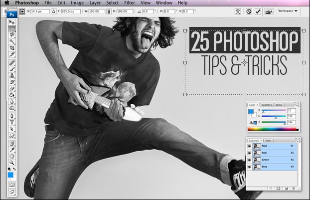
We don't find it at all hyperbolic to say Photoshop changed the design game. Designed by a University of Michigan PhD student by the name of Thomas Knoll at the behest of his brother—and Industrial Light and Magic employee—John, Photoshop has become synonymous with image editing. Now owned by Adobe, the software and in its 12th iteration, the program is the undisputed bedrock of the design industry.
More impressive than its dominance in the design world is the power it has given to those not in that world. Yes, Photoshop costs $700, but once you have it, you're rocking with the same software that every professional, in all corners of the globe uses. Where as before you would need to entire design labs complete with darkrooms, now all you need is a MacBook Pro and Photoshop.
But the software is only as good as the person who uses it. So, to help those of you who want to start getting your design on, we've put together 25 Photoshop Tricks That You Should Know.
25. Rounded Corner Frame
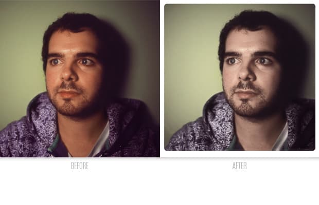
Back in the days of film, some labs would print photographs and round off the corners of the frames. This effect can also be used for any other shape.
- Duplicate the background (image) layer.
- Select the background layer and fill (Edit > Fill...) with white (or black or whatever color you want to appear as the frame for the image).
- Select the Shape tool on the Toolbar. Right click on it to select different shapes. For example’s sake, select the rounded corner rectangle tool. Set the Radius to 30px.
- Draw your frame over the image. Move it with the Move tool.
- Drag the duplicated image layer over the shape layer in the Layers palette. Alt+click on the image layer to create a clipping mask and apply the frame.
24. Washed Out 70s Feel
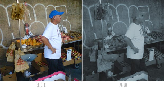
Real photographs fade over time, but not evenly across the color spectrum.
- Create a new Hue/Saturation layer and change the blending mode from Normal to Saturation
- Check “Colorize” at the bottom of the adjustment window and set the Saturation to about 15, Lightness to about -28.
- To lower the contrast of the image, create a new Curves layer above that Hue/Saturation layer and raise the leftmost point (the black point) to about input 0, output 20.
23. Miniature Effect
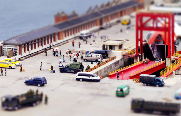
This effect’s been going around the Internet for a few years now, but it’s still neat. Most modern cameras have fixed lenses and sensor positions. This treatment replicates the focus of a large format camera with heavy shifts to how the lens sits, causing focus to fall off above and below and giving the impression that the subject matter is tiny.
- Duplicate your background (image) layer.
- Convert that layer for Smart Filters (Filter > Convert for Smart Filters) so you can go back and adjust the amount of blur we’re about to add.
- Apply a Gaussian Blur via Filter > Blur > Gaussian Blur. A healthy amount, say 15px, is good to start off with.
- On that same layer, create a layer mask by clicking the mask icon at the bottom of the Layers palette.
- Go to the Gradient tool on the toolbar and change the type of gradient to Reflected (fourth icon in on from the left).
- With the mask selected on the Layers palette, draw a vertical line from the center of your subject to the top of the image. Where you start your line will be where it is most sharp.
- Go back and double click on the Gaussian Blur layer to add or remove blur to make it a little more seamless.
POST CONTINUES BELOW
22. Basic Liquify
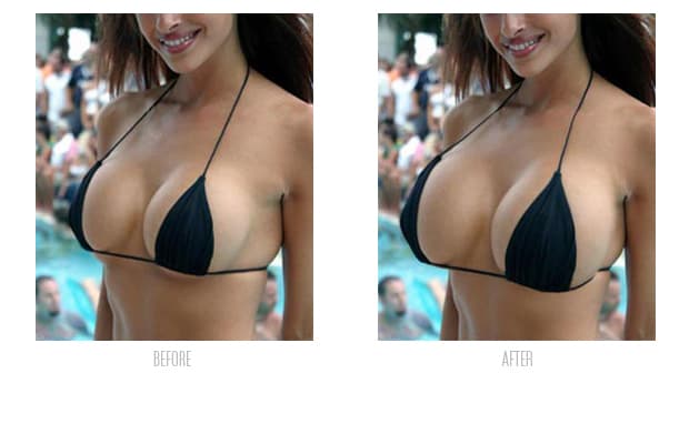
The Liquify tool (Filter > Liquify) is one of the more powerful controls in Photoshop. It allows you to push around the pixels; stretch out certain areas, shrink others, pull in a jawline, any number of things. It’s the “airbrushing” side of photoshop. The panel on the left of the Liquify window actually dictate what your brush is going to do; holding your pointer over them reveals the tooltip descriptions of each. The topmost, Forward Warp, is probably the most useful as it nudges the pixels in the direction you push the pointer. To adjust intensity and amount of movement, change your brush size and density, respectively.
21. Shadow/Highlight Tool
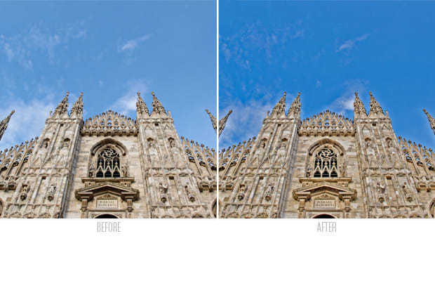
The shadow/highlight tool (Image > Adjustments > Shadow/Highlight) is a quick and dirty way to bring out details lost in muddy shadows or bright images. The basic settings come up as default, with just two sliders, one for recovering detail and generally darkening down brighter areas and one that does just the opposite in the shadows. Checking Show More Options brings up more detailed sliders; Tonal Width controls just how much of the image is considered in the shadows, Radius controls how much to blend between the areas being affected and not. Color correction adjusts for shifts in saturation in color, which is particularly important for highlight adjustments. Midtone contrast is a basic contrast adjustment for those areas between shadows and highlights. Best used when on night scenes with even but dark lighting.
20. Adding Fill Light
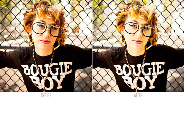
Another trick using the selections generated from Channels as adjustment layer masks.
- Load the RGB channel as a selection by cmd+clicking on it in the Channel palette.
- Create a new Curves layer, automatically creating a layer mask with the selection.
- Alt+click on the selection and invert it by hitting cmd+i.
- Apply a curve to the mask by hitting cmd+m.
- Move the leftmost point (the black point) to about a quarter of the way in. Move the rightmost point (the white point) to about three-quarters of the way in.
- Right now, the mask is adjusted to just the midtones of the image. Return to the normal view by hitting the eye icon on the curves layer.
- Pull up on the curve at about halfway to apply a bit of fill light to your image’s shadowy areas.
19. Non-Destructive Workflow
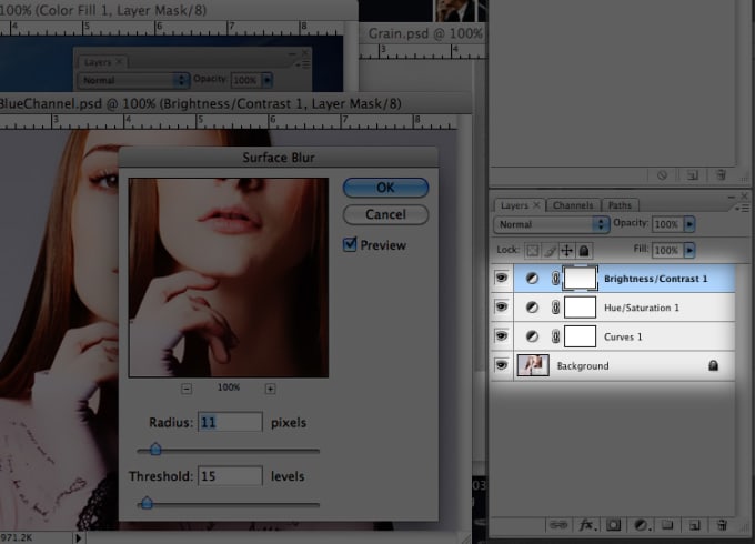
At the simplest level, a non-destructive workflow means that you never actually work on the background layer of the image. By adding adjustment layers and layers filled with Heal Brush-ed and Clone Stamp-ed retouches, you are adding to the file size, but in the end you aren’t actually changing the original file. This is paramount if you plan on doing any more work on the files in the future, including printing or sizing for web.
18. Redeye Removal
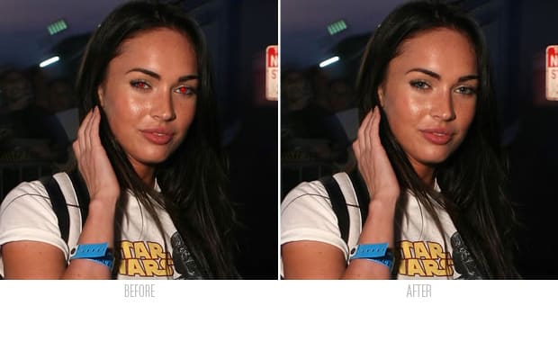
This is in the same vein as taking the yellow out of teeth.
- Create a Hue/Saturation layer via Layer > New Adjustment Layer > Hue/Saturation Layer.
- Select the white box (the mask icon) of the new Hue/Saturation layer in the Layers palette and fill that with black (Edit > Fill...)
- Using the brush tool, paint white over the red in the eyes you’d like to remove.Nothing will change as we’ve not adjusted the Hue/Saturation yet.
- Back on the Adjustment Layer panel, change the colors affected from “Master” to “Reds”. Reduce the Saturation level to about 15% and raise the lightness to remove shadow in the eyes.
17. Actions/Batch
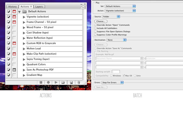
The actions palette allows you to hit record, do any number of actions on an image, hit stop and repeat that exact same process on any number of images. It’s particularly helpful for resizing images (under Image > Image Size...I) or adding a slight bit of contrast via a curve layer over many documents. Under File > Automate > Batch..., you can point to a folder of images on which to run any action you’ve already recorded.
POST CONTINUES BELOW
16. Image Processor sizing for Web
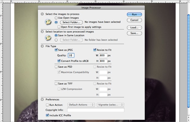
Photoshop has a built in automated image sizing program.
- Select File > Scripts > Image Processor...
- Check “Select Folder...” and point to where your files are.
- Check “Save in Same Location”. The process will create a JPG folder inside of the one that you just pointed to for the new, smaller files.
- Check “Save as JPG”. Set quality to 10 (the maximum is 12; the lower you go, the smaller the file size, but the worse the compression on the image).
- Check “Resize to fit”. Enter 800px for both width and height. This will ensure the longest edge is only 800 pixels, just fine for web. Smaller is fine, however.
- Check “Convert Profile to sRGB”. It’s safe to assume the majority of internet browsers out there are incapable of reading anything besides the sRGB colorspace, so this is a best bet if you want your colors to translate correctly from screen to screen.
- Hit Run. The script will open, resize and save a copy of those files you pointed to.
15. Best Camera Settings
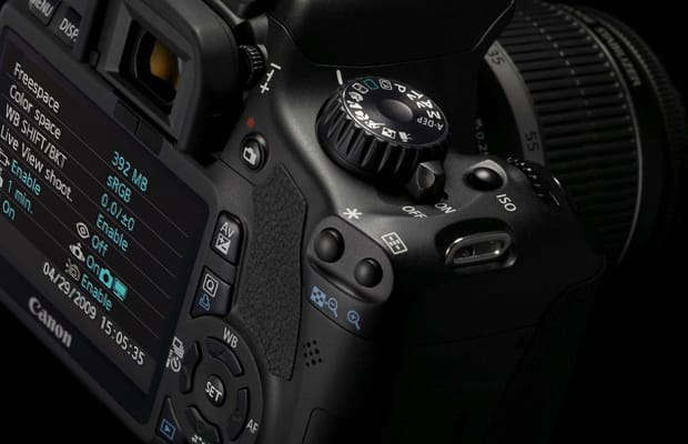
This all depends on the make/model of camera, but the best practice for capturing images is to have the following settings:
- Adobe 1998 colorspace as opposed to sRGB, the standard for many point and shoots.
- RAW file capture instead of JPEG, which crunches the file size but loses the majority of detail.
- The lowest ISO setting possible, to avoid noise caused by higher sensitivities.
14. Hazy Lights
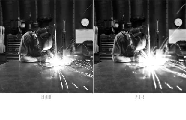
Adding haze around lights gives a dreamy feeling, and when combined with a lowered saturation and an amber cast, gets fairly close to the feeling of a summer dusk.
- Under the Channels palette, cmd+click on the RGB channel to load the brightness levels as a selection.
- Returning to the layers palette, create a new Curves layer. The selection is automatically loaded as the mask.
- Alt+click on the mask icon on the Layers palette. A black and white representation of the mask will come up over the image. Hit cmd+m to bring up a Curves adjustment. This is adjusting the mask we’ve just loaded. Drag the leftmost point on that curve to the right, blacking out all but the brightest of white parts of the image. Click the eye icon on that layer to return to the normal view.
- Select that layer mask icon and blur it via Filter > Blur > Gaussian Blur. 5 pixels works fine for me.
- Put a point at about 80% on that curve and pull it up. It’s brightening the area around the lights, with the blurry layer mask adding the haze factor.
13. Smart Filters
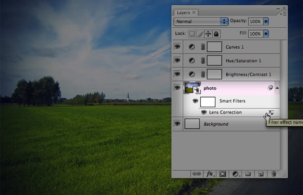
Smart filters were introduced in Photoshop CS4. “Convert for Smart Filters” allows you to change a filter you applied to a layer earlier. For example, if you’ve converted a layer for smart filters and added blur, you can go back later and remove some blur without losing the original fidelity of the image. They increase your file size tremendously, but if you’re going to save the final version as a jpeg for the web, it’s not a bad idea.
12. Catch-Lights
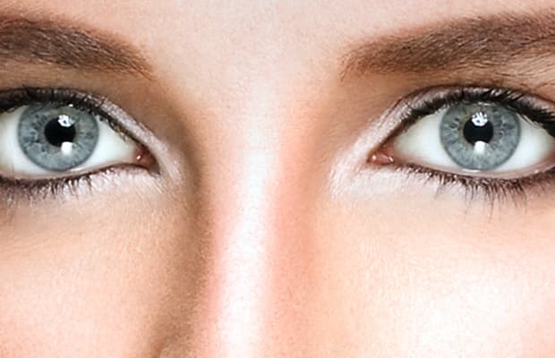
Catch-lights are just reflections of light in the eyes. The absence of these reflections makes anyone look dead. Adding them back in is a quick fix.
- Create a new Curves layer via Layer > New Adjustment Layer > Curves. Fill the mask for this layer with black.
- Drag the top-right point (the white point) of the curve graph to the left from 255 to about 180 (the point should now read input 255, output 180).
- Zoom in on the eyes to be fixed. Using a hard-edged brush at 100% opacity, do a light, quick brush of white on the mask, revealing the curve adjustment we just made.
- Adding just a glint of highlight in the eyes adds immeasurable amounts of light.
11. Selective Color Matching
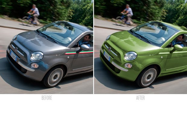
- Matching colors in a scene creates cohesion within the frame; matching the red in lipstick to red in wallpaper, blue in eyes to the sky, etc. Basically simplifies an image by removing extraneous colors; a simplified color palette is a “tighter” feeling photograph.
- This varies from image to image, but using Selective Color, Hue/Saturation and Curves adjustment layers will get the majority of the work done. Changing the blending mode to “Color” for any of these will help as well.
POST CONTINUES BELOW
10. Old Flat Look #1
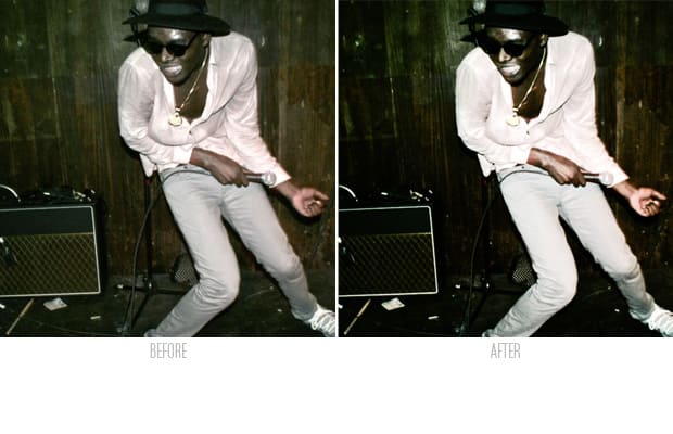
- Create an inverted selection of the blue channel (cmd+click on the Blue channel in the Channel palette) and select the inverse by pressing cmd+shift+i.
- Make a new curves layer. That inverted selection is automatically turned into the mask for our new curves layer.
- Change the blending mode for that layer from “Normal” to “Luminosity”. This stops the colors from shifting but will change their brightness.
- Add two points to the curve, pulling the right up and the left down, creating an S shaped curve.
9. Channels as Masks
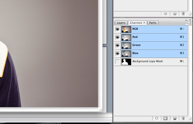
- Masks are basically filters as to what part of the photograph is affected by the adjustment layer you’ve created.
- The Channel palette lets you adjust specifically the Red, Green and Blue channels independently.
- This is useful for removing blue noise in the shadows in a night image shot at high ISO or upping the intensity of the greens in a panorama.
8. Dodge/Burn
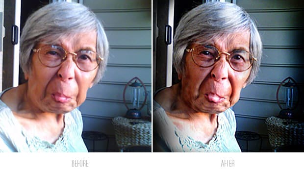
If you need to lighten (dodge) or darken (burn) parts of you image or photograph, here's how you do it. No dark room needed. Be easy with this one, as well, folks.
- Create a new layer via Layer > New... > Layer. Name that layer Dodge/Burn. Change the blending mode to Overlay, and again make sure that “Fill with 50% gray” is checked.
- Select the brush tool and reset your foreground/background colors to black/white by pressing D. Change the opacity of the brush at the top of the screen; 5% is a pretty good start, but anywhere above that can be too strong.
- Brighten highlights by painting in white on the Dodge/Burn layer. Darken shadows by doing the same. It is possible to darken highlights by painting them black, but it tends to turn out pretty bad. Better to use it to accentuate things such as highlights in hair, or wrinkles in hands. It’s most effective on black/white images.
7. Square Crop Theory
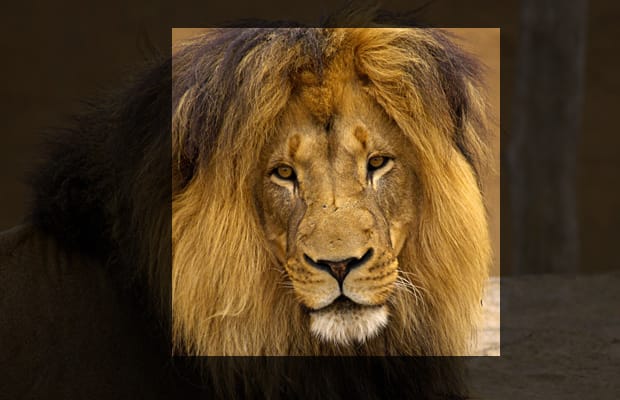
Cropping an image square cuts down on the perceived horizontal-ness or vertical-ness of an image. When the dominating line of a horizontal image is the horizon, someone looking at it will just follow that line. Same thing with a vertical image. Square images allow the eye to wander around a bit.
6. Vignette
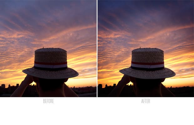
- Select the Circle Marquee tool (located under the Square Marquee tool, right click to select the Circle one). Adjust the feather setting to about 200px.
- Create a new curve layer by selecting it from Layer > New Adjustmet Layer > Curves.
- Darken it down. Add a point on the curve at about the middle point and pull it down to your heart’s content.
5. Teeth Whitening
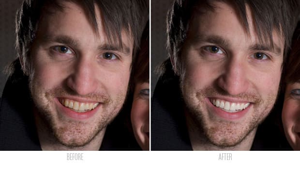
Removing the yellow from teeth is very easy to overdo. Take it easy on this one.
- Create a Hue/Saturation layer via Layer > New Adjustment Layer > Hue/Saturation Layer. On the top of layer palette, change the blending mode from Normal to Color.
- Select the white box next to the icon of the new Hue/Saturation layer and fill that with black (Edit > Fill...).
- Select the brush tool and paint white over the teeth you’d like to change. Nothing will change as we’ve not adjusted the Hue/Saturation yet, but paint it back in anyway.
- Back on the Adjustment Layer panel, change the colors affected from “Master” to “Yellow”. Reduce the Saturation level to about 15% and raise the lightness to remove black.
POST CONTINUES BELOW
4. Amber Gradient
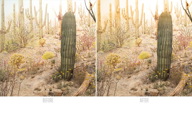
I always look for driving sunglasses with a strong amber gradient; it adds an instant summer-like look no matter where you are. The same can be done with photographs.
- Click your foreground color swatch and select a nice amber orange.
- Create a new gradient layer via Layer > New Fill Layer > Gradient. Check “Reverse” or rotate it 90degrees.
- Change the blending mode of that new gradient layer to “Color” and reduce the opacity to about 40% or so.
- Instant summer.
3. Cleaning Skin with the Clone Stamp and Healing Brush
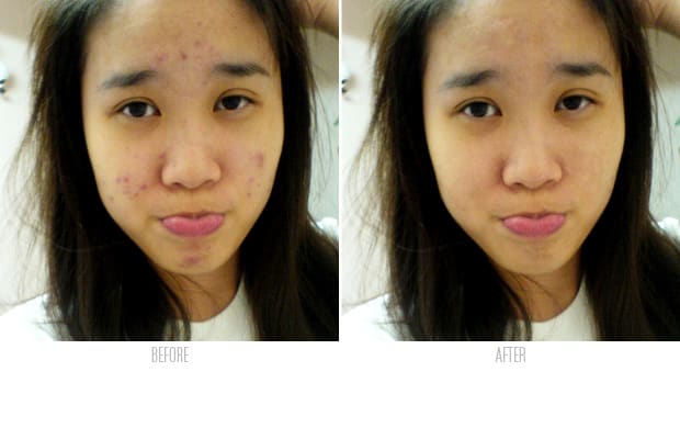
When the surface blur isn’t good enough to single out a massive zit or black eye, using the clone stamp and healing brush will cure it away. Here’s how to use them correctly.
- Create a new layer by going to Layer > New... > Layer or cmd+shift+n.
- Go to the clone stamp on your tools palette. Make sure the Sample menu on top reads “Current and Below”. This allows you to work on top of your image rather than on it directly, making it easier to fix mistakes.
- The Clone tool is basically a copy and paste, but with the copy being of relative distance to the pasting area. Holding alt brings up a crosshair; this is where you’re copying from. Clicking anywhere after that sets the copy/paste distance. Soften your brush and lower the opacity to smooth it out a bit.
- The Spot Healing Brush is a more detailed way to clean up skin. Just click on the area you want to blend into the area around it. Trial and error is best here, but using a soft-edged brush is key.
2. Cleaning Skin with Blue Channel Correction
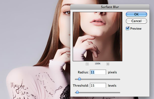
This works to clean up blemishes and ugly skin on shots with a lot of skin showing. It works because the majority of skin imperfections can be picked up in the blue channel.
- Duplicate your background layer
- Go to the channels palette and select the blue channel by holding command and clicking the mask icon.
- Select the duplicate background layer. Add a mask to the new layer by clicking the Add Mask icon at the bottom of the palette.
- Add a surface blur filter by selecting Filter > Blur > Surface Blur. A smidge will do, but overdo it a little. Adjust it later via the layer opacity setting.
1. Grain
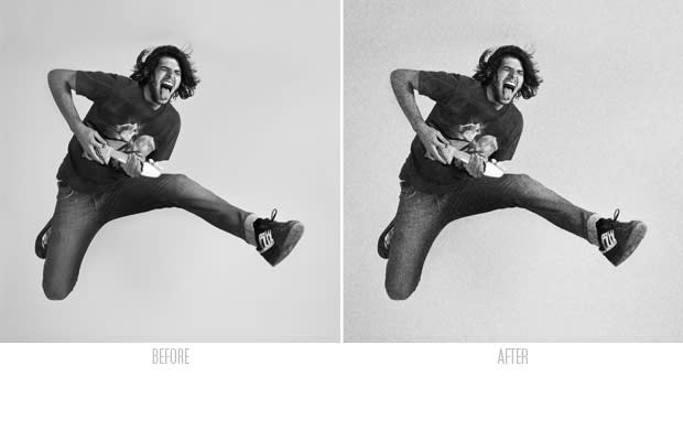
This works best on black and white or generally monochromatic images without a lot of detail. The fake grain adds the “feel” of detail.
- Create a new layer by selecting Layer > New... > Layer. Change the blending mode to Overlay and check “Fill with 50% gray”.
- Select Filter > Noise > Add Noise. 15% is a good starting point.
- Blur the noise a bit by adding Gaussian blur via Filter > Blur > Gaussian Blur. Add 2.5 pixels blur.


0 comments:
Post a Comment